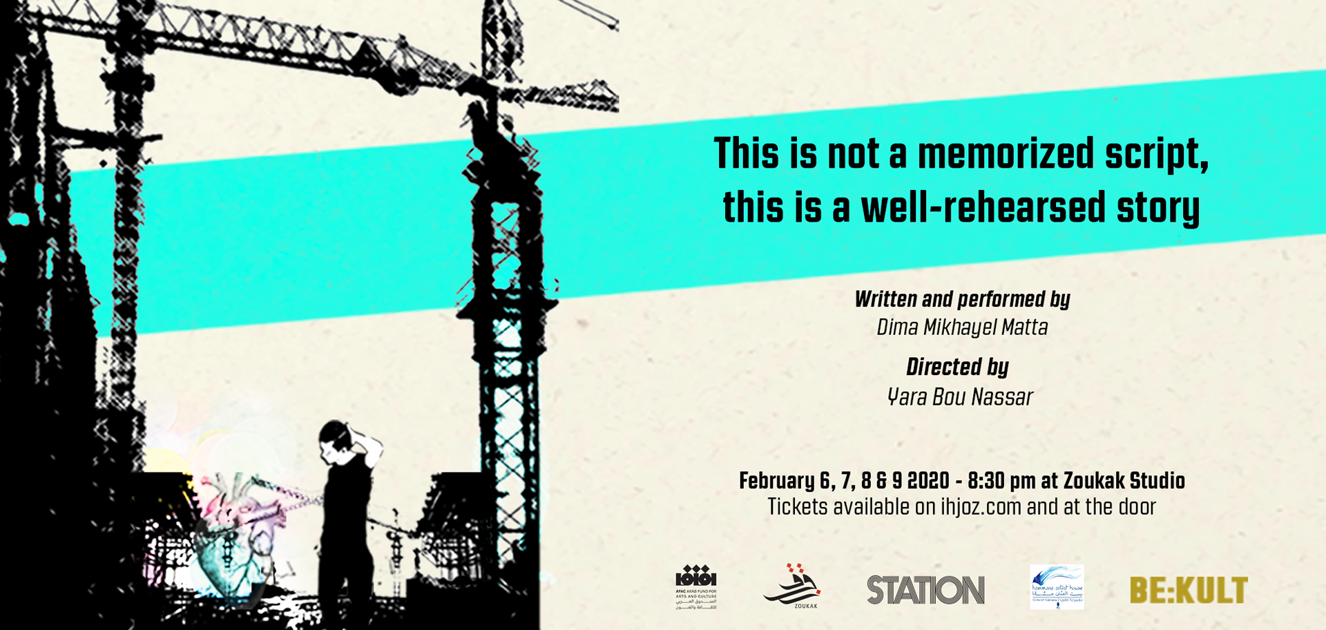
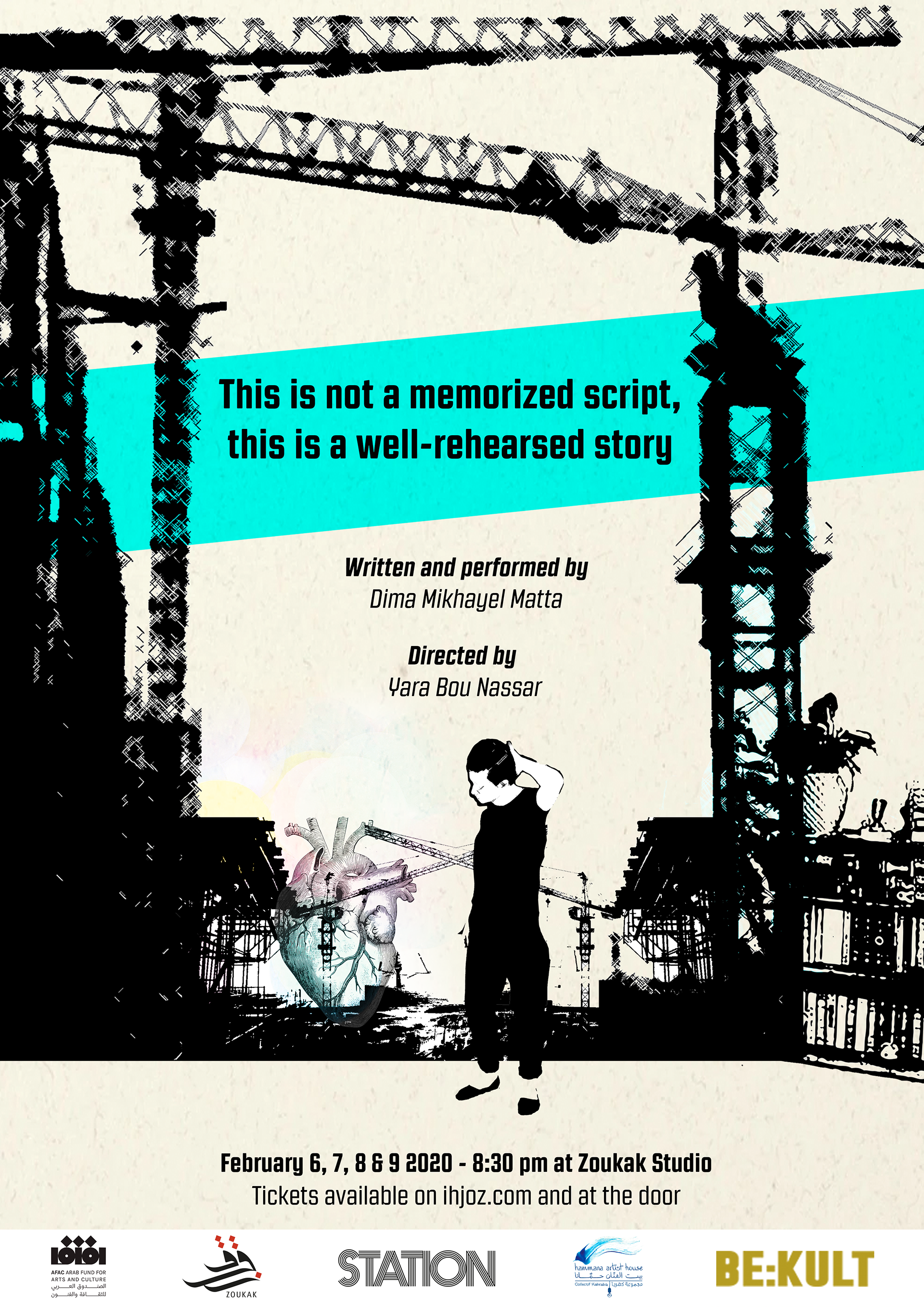
The poster design for the play was created to establish a clear visual identity grounded in expressive imagery and typographic structure. Grunge-inspired aesthetics and typographic choices were used to reflect the energy of Beirut and the production’s queer storytelling, while maintaining clarity and hierarchy. The design system was adapted for social media formats through considered adjustments to layout and scale, ensuring consistency and legibility across platforms. The resulting materials function as an entry point into the production, using visual language to support the narrative and emotional context of the play.